ShopDreamUp AI ArtDreamUp
Deviation Actions
Daily Deviation
Daily Deviation
May 17, 2006
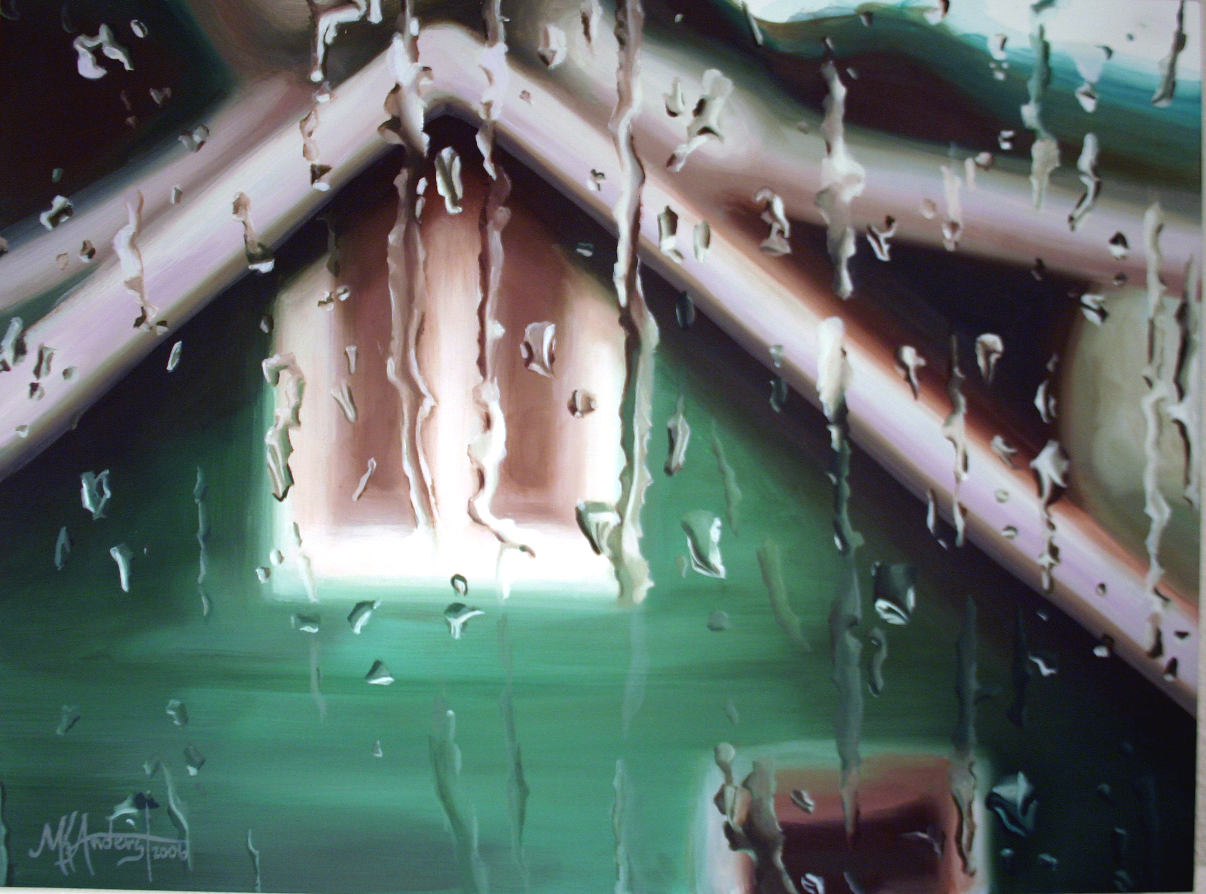
Drops on a Surface by ~MichelleAnderst is certainly one trippy painting!
Featured by De-Profundis
Suggested by Anavelle


Description
Oil on panel
12x16
This painting was based off of a photo I took of the house next door.
I really tried to work on color in this one. At first I wanted to make everything really monochromatic in all green tones but decided to put red in the shadows (I have been playing with complementry color lately) so I think the color contrast and the contrast between blurry and sharp is what made it successful. I also wanted to make the drops look like they are laying on the surface of the panel which makes the panel become the actual glass of the window.
Image size
2368x1756px 2.48 MB
Make
Canon
Model
Canon EOS DIGITAL REBEL
Shutter Speed
1/40 second
Aperture
F/3.5
Focal Length
21 mm
ISO Speed
400
Date Taken
Mar 4, 2006, 8:52:59 PM
© 2006 - 2024 MichelleAnderst
Comments135
Join the community to add your comment. Already a deviant? Log In
awesome painting !!